Empire game map boards, and resources for making them.

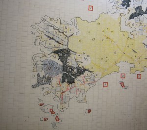
Photo of a left-side portion of Andrew Nisbet’s “Drowned Australia” map for Empire
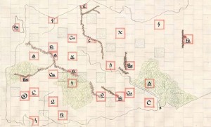
Empire maps are huge—72 inches wide and 42 inches tall, divided into a total of 3,024 one-inch squares. These squares are offset so that each square touches six of its neighbors. Most maps depict a world built on a cylinder: the ends connect horizontally, but not vertically. Nearly a dozen maps were drawn in the 1960s and 1970s; most survive in reasonably decent shape, considering their age and use. Many of them are posted here, and more may show up in the future.
In addition to being imposing game boards, Empire maps are also remarkable works of art. Hand drawn on large rolls of paper, each map took its primary artist many hours of planning, drawing, and calligraphy. Most of the surviving maps were designed by Andrew Nisbet, while Cecilia Eng did the calligraphic letters, compass rose lettering, and much of the nicer shading (for example, those maps that have blue shading around the water edges). Most of the maps that work well for actually playing Empire are optimized for about eight players, and have natural starting areas for each player (see notes on each map for ideal player count).
Scanning well-worn 40-year-old maps the size of a large dining room table is not for the faint of heart, but good scans of some of the maps are found here. Yes, the files are large and somewhat unwieldy, but not nearly as large and unwieldy as the original TIFF files (also available, for the stout of heart), nor as the more-original rolls of paper.
To play a game of Empire, the large map must be placed on an even larger table. Extra space is required around all sides for an astonishing amount of ancillary crap—unused pieces, dice, the rule book, intimidating amounts of paperwork, food and drink (despite the explicit requirement that no food or drink be placed on these fragile and beautiful maps, it was rare to visit the Empire Room without seeing Big Gulps perched precariously around the edges of the table).
Where both med-fi and hi-fi versions of a map are presented below, the med-fi version would be fine for viewing on-screen and general examination. Only if you intend to print out the map at full original 72″ x 42″ size might you consider a hi-fi version—those are some very big files at 100–500 MB each. Even then you might be fine with the med-fi version.…
There are also some newer maps and other map-making tools in the works.
Map Tools
Blank grids can be used to make maps or printed on clear plastic as an overlay for existing maps. Also presented is the PostScript program for making such custom grids.
Emergency management symbology fonts. Useful symbols such as bridges, airports, etc. From the US Dep’t of Homeland Security.
The National Park Service offers all sorts of useful symbols (in various formats), PLUS several awesomely useful Illustrator swatches (lava/reef, sand, swamp and tree). The tree pattern looks a lot like forest graphics from a classic wargame, and the swamp symbol looks just like the swamps on existing Empire maps.
Classic Empire Maps
These maps are presented in approximately historical order, from oldest to newest. If you’re looking for maps to actually play, consider especially Ackerman II, Big, and Archipelago. Most maps have resources distributed in clumps and thus have a specific ideal number of players; this is noted where the information is available.
- Ackerman IIa. A near re-creation of the second map made by Alan Ackerman. This map features large continents and a central ocean with a large divided island. Good for games with many players. More Empire games have been played on this map than any other. One of only two maps known to have been recreated when lost or damaged. When the original Ackerman II disappeared, it had been the most popular map available, so a combination of in-game records and memory were used to recreate it as closely as possible. Records often indicated where certain features were on the map, some players had drawings of their areas of the map, and some simply remembered key facts like the exact distances between certain resource locations. Andrew Nisbet comments that he was surprised at how easily the map was recreated.
- 8‑player map
- Med-fi 150 dpi (with JPEG compression) PDF (5 MB)
- Hi-fi TIFF (coming soon)
- The Archipelago (Circle) by Andrew Nisbet. Only two games were ever played on it. A large circular ocean is surrounded by a large continent, a small continent, and many islands. Hint: build a navy.
- Big. A map with a very large continent divided by many mountain chains and other interesting geography. Drawn by Andrew Nisbet in the spring and summer of 1973, several games have been played on this one. Andrew considers it not a great map.
- Ten Steel. An experimental map by Andrew Nisbet. The idea was to balance three large countries with lots of steel production (good for ground forces) with a bunch of countries able to make other kinds of units such as air forces. Unfortunately, it turned out that the big conventional countries can overwhelm the others before they get to the point of exploiting their more specialized resources, so Andrew counts this as a failed experiment.
- Downloads coming soon
- Med-fi 150 dpi JPEG (X MB)
- Super-hi-fi 300 dpi TIFF (XXX MB)
- World Map. Created by Andrew Nisbet, Charles Averill and Cecilia Eng. Charles had a copy of the Oxford World Economic Atlas, which was used to determine resource distribution based on then-current production of resources. As it turns out, the real world mad a great-looking map, but a terrible Empire game. All the resources ended up in the wrong places to make interesting Empire countries.…
- Hi-fi 300 dpi JPEG (13 MB)
- Nameless Nisbet map. Drawn by Andrew Nisbet, this map was an experiment that did not quite work out, says Andrew—neither great nor awful. The map also suffered some water damage.
- Drowned Australia (The Desert Map). Decades before the current interest in global warming, Andrew Nisbet decided to see what Australia would look like if sea levels rose a lot. A whole lot. Andrew’s last map, and (in his opinion) his prettiest.
